Branding
Editorial
Packaging
2019
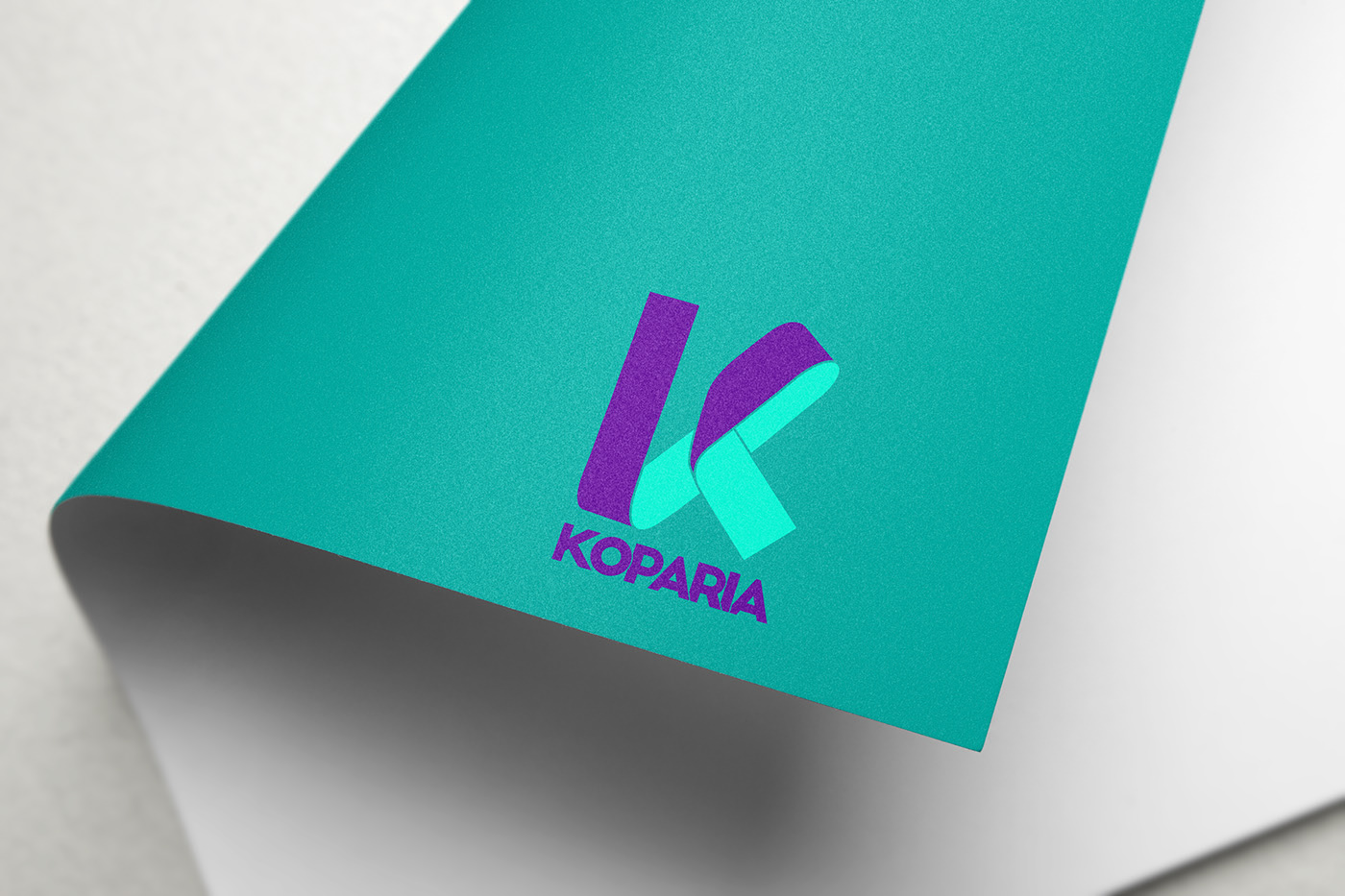
Koparia is an expanding company that develops its work by producing merchandising and advertising products. The company wanted to reach new markets and position itself as a sector leader, reliable. The new identity is appealing and transfers the professionalism inherent in Koparia.


Koparia had no recognizable branding. The logo was old-fashioned, and had no solid, complete image that would help. In this redesign, the green and purple colors that were characteristic of the brand have been restored. The letter K of the original Koparia has also been preserved as the axis of the new personality, but more distinct and professional.

